A football kit can evoke countless memories and form part of one’s identity to their team, and often online concepts do a marvellous job in making you wish they were coming to a store near you.
Liverpool have now seen six different manufacturers try their hand at delivering a collection of kits, most whom have experienced vast degrees of success.
The look of any one kit, in line with Liverpool’s on-field pursuits, can create a real sense of connection and subsequent nostalgia in the years to follow.
On the other hand, manufacturers can miss the target completely and leave fans dreamily looking at what could have been if others were tasked with the job.
There are no shortage of concept kits across the web made by talented graphic designers, and these are just some of the ones we wish were real.
Home
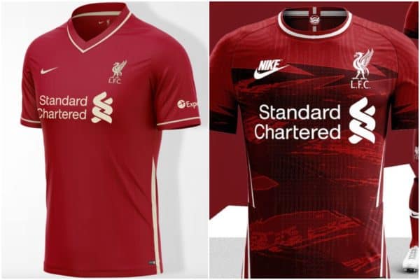
With an all-red kit there is not always scope for drastic change, but the shade of red and the small details can be what elevates it above the rest.
Pinstripes have proven a hit in recent years, and @LongdayKit has continued with the theme in a sophisticated and clean look – using a beige to offset the red.
It’s a real stunner when you also add the v-neck into the mix:
Liverpool FC | Nike | 21/22 Concept Kit
21/22 colour leak by @Footy_Headlines #LiverpoolFC #Liverpool #YNWA #LFCMUN #PremierLeague #Anfield #liverpoolfans #mosalah #LFCfamily #Klopp #WeAreLiverpool #liverpoolfootballclub #lfcfans #kopites #JF96@LFC @nikefootball pic.twitter.com/XQHWyeX535
— LonGdaY Kit (@LongdayKit) January 18, 2021
And @cfk.designs has taken a bold approach with slashes of different shades or red across the torso and the sleeves with a retro Nike patch. Yes please:
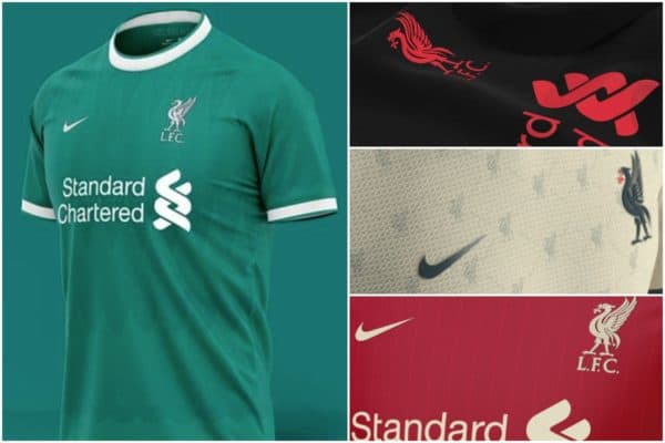
Away & Third
There is a much greater licence to explore colour and design with the away and third kits, as we’ve seen with ‘toxic thunder’ and ‘bold citrus’ – meaning they’re not always to everyone’s taste.
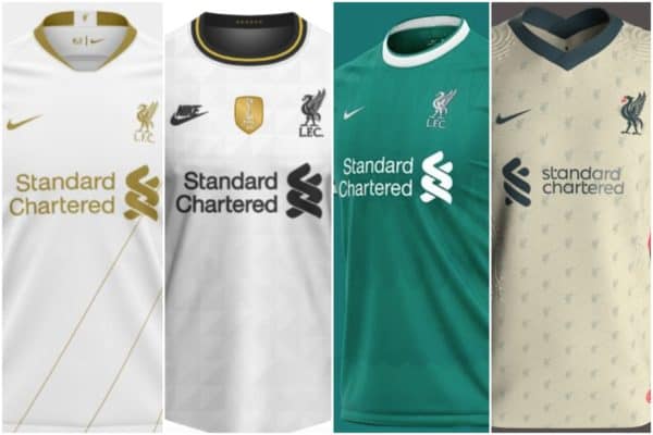
But you can’t really go wrong with white and gold, however, as this brilliant design from @eenhoopjob shows, where three simple diagonal stripes provide enough detail without being too in your face:
A subtle geometric look paired with retro Nike and a combination of white, gold and black comes from @StevenTaylorMade, and it’s simply beautiful:
Liverpool UCL change kit concept ??? pic.twitter.com/ci4EfAnDG5
— LFC92 (@LFC92) April 7, 2020
But a light teal with white detailing holds a lot of nostalgia for Reds as it is a throwback to the early 1990s and throughout the 2000s.
And that is why @saintetixx’s is simply stunning, where the soft touch of triangular shapes elevates its design:
Using Nike’s current template @AshleyPeake8 has brilliantly used the Liverbird as the background feature for this beige, dark green and red away kit – all which blend perfectly together:
Here's my @LFC @Nike @nikefootball Away Kit
Thoughts?@SMane_Officiel @liverpool @RedStarLvrpool @LivEchoLFC @LiverpoolFCW @ynwagram @anfieldonline @thisisanfield @TheAnfieldWrap #YNWA #LFC #Liverpool #Anfield #ConceptKit #KitConcept #UCL #Football #Nike #Concept #Soccer pic.twitter.com/Qa5HxQhfWO— Ash's Custom Graphics (@AshleyPeake8) March 20, 2021
Black and bold
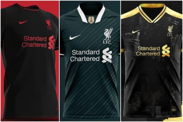
There’s just something striking about a black kit with a pop of colour, whether that be gold, red or white – they immediately catch your attention.
The contrast is what grabs you, and like Alisson‘s goalkeeper kit in the 2019/20 season, they also readily prove to be fan favourites.
And @saintetixx’s ‘infrared’ concept certainly fits the bill, with its simplicity hitting all the right notes:
While a concept made back in 2019, this Nike look from @krisjevisuals sees black paired with white in another simple design that also has an interesting level of intricacy to it:
And, finally, @TDZNgraphics smashed it out of the park with this gold emblazoned concept that you would not blink an eye at seeing Liverpool don away from Anfield:
Let us know in the comments below which kit concept you wish were real!


")
Fan Comments